Is my website intuitive and frictionless throughout?
If you’ve been following from Step One, you may remember that Step Two: Competitor Research, highlighted UEO as the new SEO. If you haven’t read it, here’s a key takeaway:
SEO is more about user experience optimization (UEO) than optimizing the search engine.
That makes user experience then, your most important focus for getting your site ranked.
And how does UEO relate to competitor research? Well first of all, discovering how to enhance, or in a worst case scenario, dredging your user’s experience up from the bottom of a mucky pond to the surface light of day, starts by watching your competitors with a keen eye.
But there’s more to it than that.
When you created your site, you didn’t create it for silent, mechanical aliens that would follow clickbait like naive school children follow Bobo the Clown. Not even close. You made it for real live people. People with different problems and pain points. People with very personal frustrations and levels of tolerance. People dotting the entire spectrum of tech savviness.
And although you know it is a rather unrealistic desire, your intention is to make every page on your site 100% accessible to everyone who lands on it. And so it should be, realistic or not.
You’ve got to get inside the head of your ideal customer and know what is going to frustrate the crap out of them and do everything you can to avoid creating that kind of experience.
Then, you’ve got to know exactly what makes them stay on your page and eventually convert and feel that it’s one of the best decisions they’ve made this year. And then you create that experience too.
Easy, right? Well, sort of.
The best way to get started is to visit as many websites in your industry as your sweet time allows and note every little thing that makes you want to stick a fork in your eye and every little thing that makes your experience feel like you’re on a first class flight with Emirates. Then compare these features to your own site.
How Do You Know What Your Customer Wants?
But once you’ve done that, how do you actually know that everything you’ve set in place to create the best user experience is actually, well, the best?
Google Analytics helps track user behaviour so you can get a deeper look at what parts of your site are keeping people engaged, and which ones are encouraging them to take a hike.
Let’s look at the specifics of what GA can track:
- Where a user entered your site and where they left
- Their navigation and interaction with your site (this helps you figure out if your CTAs and internal links are in sensible locations)
- What device they use to view your site (this helps you further optimize your site for specific devices based on popular use).
(And remember, GA is a free tool).
Now this next tip is a bit Sherlock so prepare yourself:
Ask your customer.
I know, right? It’s like telling someone to check that the TV is plugged in when it won’t turn on, but so many of us ignore the simplest way. Our complex brains like complication.
So how do ask? Check out Step Six: Reviews for tips on how to ask your customer.
What About Information Architecture?
Neil Patel tells us that at the core of the user experience is information architecture. A basic understanding of information architecture is outlined in the image below:
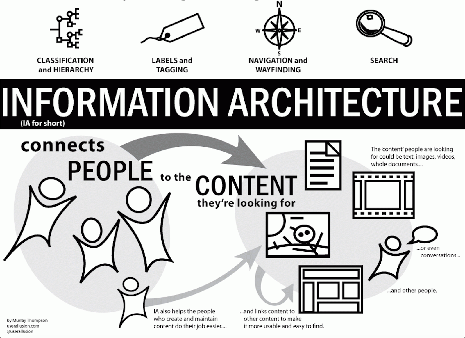
Source: Neil Patel
So now we’ve got the fundamentals outta the way, let’s look at a few more superficial but equally valuable components of UX.
Aesthetics
This may seem obvious but we have to ask: Does your website look nice? Is it tidy or cluttered with content and images? Are your chosen colours complementary? Does your logo actually capture the ethos of your business? Is there any possibility that it overwhelms or confuses? Remember, simple is best for any site of any business in any industry. You don’t want to make people work to buy your product or service because they won’t.
Quality and Readability of Information / Voice
A great majority of the adult population cannot read past an eighth grade level so unless your business is highly technical or you, for some reason, require a great deal of nomenclature in your content, then write for the eighth grade reader. If you can’t write, you’re not alone, and there are plenty of professional copywriters out there who can deliver some bang-up content. Choose someone who is able to capture the voice of your business and stick with that person. Using too many different writers will make the voice of your business sound less cohesive and convincing, like reading a novel where the writers change from chapter to chapter.
Now remember, and this is where it falls apart for a lot of businesses: make sure your content is well-researched, quality stuff. People can sniff out bullshit faster than our overpopulated planet can churn it out. Make your shit unique and the stuff of roses, stuff people can actually get something out of.
Extend the Learning Journey
Think of your site as a trip to the science centre. Each station should draw you in, entice you to know more, indulge in your curiosity and fascination about the way the world works. So too should your site about your product or service. Use whatever means are necessary to keep your user engaged. Include links to where they can get more information, whether that’s on your site or an affiliate’s. Use appealing images, photos, videos, or memes that support understanding, that deliver a bit of humour, that invite the reader to further question what they’ve read (and then invite them further down the learning path). In short, give them an experience.
Calls-To-Action
CTAs might be the most important part of your site––where they’re placed and how they call users to convert.
Forget the old, boring “buy”, “purchase”, or “submit”. Get creative (or trust in your content writer to do what you paid her to).
Remember––a user is a person too!
When we’re bogged down by metrics, it’s easy to forget that there are real live people behind those numbers. And what drives most people to buy?
They have some painful, nagging thorn in their side that makes them need your product to remedy their situation.
People don’t buy your product because it looks nice. They buy it because it solves a problem.
Maybe they don’t know they’re in pain, which is why you need to remind them, strategically, at each step of the conversion cycle and use the CTA as an opportunity to highlight, once more, how your product is going to solve their problem. Now make sure that problem-solving actually alleviates their pain rather than contribute to it.
You got this. Leave a comment and let us know what your main UX gem is.